
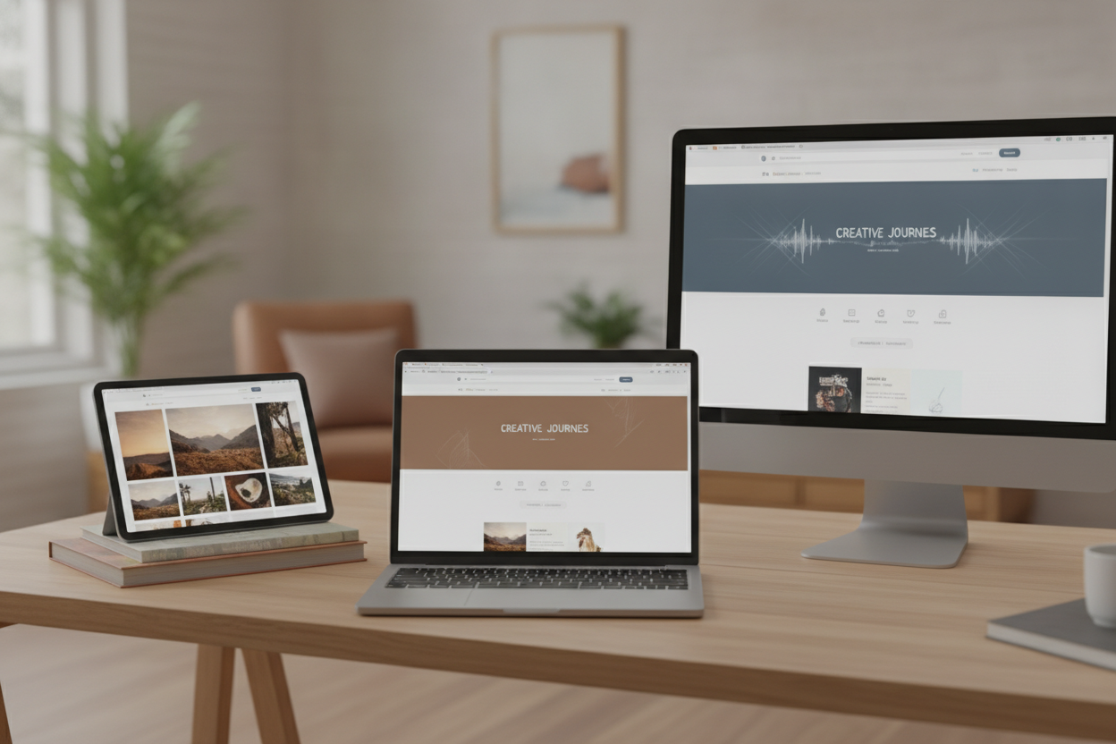
A simple portfolio works best when visitors can understand it almost immediately. Clear sections, intuitive labels, and a calm visual flow help people explore your work without feeling lost. For a creative site like MUNA, that simplicity is not a limitation. It is part of the experience. It lets the content speak first.
Start by thinking about the main categories your audience wants to reach. Music, architecture, photography, running, and poetry each deserve a place, but they do not need to compete for attention. Grouping posts and entries in a thoughtful way makes it easier for visitors to browse by interest while also discovering unexpected connections between them.
Visual consistency matters just as much as structure. If the site uses a similar tone, spacing, and image treatment across sections, the whole portfolio feels unified. That does not mean every page must look identical. It means the design should support the work rather than distract from it. A clean portfolio gives each project room to breathe.
Adding short descriptions or occasional reflections can make the site feel more personal. Visitors often appreciate a little context: where a composition came from, what inspired a photograph, or why a poem matters to you. Those details turn a gallery into a conversation. They also encourage repeat visits, because the site becomes a place to follow your creative process as it grows.
Leave a Reply